

Principal Component Analysis with Python and sklearn
Introduction
Many of you have probably played Mario Kart 64, and each of you has a favorite character! I always played with Wario, which is certainly the best one 😊.
In this game, we have 8 characters from the Nintendo franchise: Mario, Luigi, Princess Peach, Toad, Yoshi, Donkey Kong, Wario and Bowser. In general, we have the subdivision between light karts (Peach, Toad and Yoshi), medium karts (Mario and Luigi) and heavy karts (DK, Wario and Bowser), where it is common sense to say that the lighter ones have higher acceleration and the heavier ones have a higher speed; the medium ones are considered karts intermediaries.
But, is it really that? Why Yoshi is from the light class and not from average class? Are Wario and Bowser the same? You probably never asked yourself these things before, but I asked myself and decided to investigate!
To try to figure this out, we need to have some measurements for each kart. After a search on the internet, I found on this site some features of each player. The features are:
- Time (s) required to reach 30 km/h;
- Time (s) required to reach 50 km/h;
- Maximum speed (km/h);
- Time (s) required to reach maximum speed.
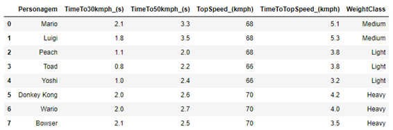
Unfortunately, I did not find information on the handling of each kart, which it would be important information for the analysis that we are going to do. The data is shown in Table 1.
Table 1 – Characteristics of each of the players in the Mario Kart 64 game.
| Player | TimeTo30kmph (s) | TimeTo50kmph (s) | TopSpeed (kmph) | TimeToTopSpeed (kmph) | WeightClass |
|---|---|---|---|---|---|
| Peach | 1.1 | 2.0 | 68 | 3.8 | Light |
| Toad | 0.8 | 2.2 | 66 | 3.8 | Light |
| Yoshi | 1.0 | 2.4 | 66 | 3.2 | Light |
| Mario | 2.1 | 3.3 | 68 | 5.1 | Medium |
| Luigi | 1.8 | 3.5 | 68 | 5.3 | Medium |
| Donkey Kong | 2.0 | 2.6 | 70 | 4.2 | Heavy |
| Wario | 2.0 | 2.7 | 70 | 4.0 | Heavy |
| Bowser | 2.1 | 2.5 | 70 | 3.5 | Heavy |
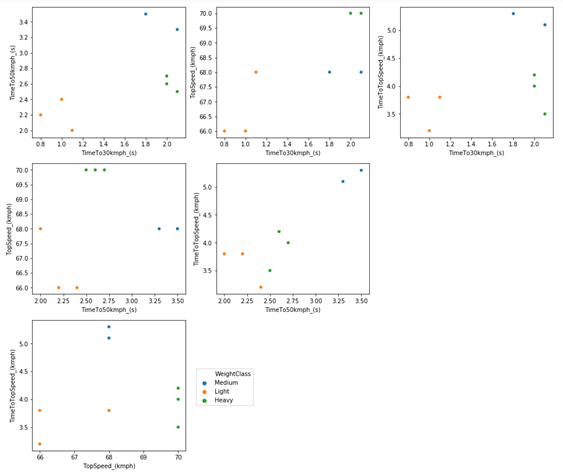
When we look at the time to reach 30 km/h, we see a very clear difference between light and medium or heavy karts. But this characteristic is the same or is very confused between medium and heavy karts.
As for the time to reach 50 km/h, we can see a difference between medium and heavy karts, where medium karts take longer to reach 50 km/h. Based on these data, we can say that light karts are the ones that accelerate faster at lower speeds. When looking at the time needed to reach maximum speed, we see that the middle class is the slowest; however, the light and heavy classes overlapped. For example, look at Bowser that reaches maximum speed in less time than Toad and Peach, despite having a slower initial acceleration.
Although it is possible to find some kind of pattern, as we saw through the maximum speed, in general, we don’t have an obvious relationship between a kart being of the lightest class and accelerating faster and having a lower final speed, and it being heavier and then accelerating more slowly and have a higher final speed. In fact, we would even have something in that direction if it weren’t for the middle class. But then, what characterizes a kart to be considered light, medium or heavy? Let’s continue analyzing the data to try to find out.
We could compare pairs of variables to try to find patterns more efficiently than just looking at numbers. An alternative is to several scatter plots (pair by pair) to try to find some kind of pattern, which can be seen in Figure 1.
Figure 1 – Scatter plot comparing each feature of the karts in Mario Kart 64.
To try to find a pattern, we will need something more complex than an analysis of the numbers combined with a graphical analysis. I could use hierarchical group analysis, but I will use a statistical technique for reducing variables, which is principal component analysis (PCA). This technique consists of calculating new variables (called main components) based on the original variables.
In fact, these main components are nothing more than linear combinations of the original variables. The great advantage of this method is that it has the potential to reduce the complexity of the data, making it easier to identify patterns, and maybe, the origin of the patterns. In other words, this technique has the potential to summarize all six graphs above in just 1 graph (depending on the data), which would certainly facilitate the interpretation of the results.
We could use different programs/languages to do this, with R being the most obvious and simple choice (check this incredible tutorial). We could also use STATISICA or even MATLAB, but they are very expensive programs, and you should never use a pirate program (really, since I developed one, I realized how easy it is to put some hidden lines of code to access data from users). For these and other reasons, I’m going to use Python, because the goal here is to use Python, because it’s free and easy to use.
PCA in Python
Python provides at least two libraries to analyze the main components: sklearn and statsmodel. Each has its advantages and disadvantages. As far as I can tell, statsmodel is a little more versatile than sklearn. One of the advantages of statsmodel is that it allows you to use the NIPALS algorithm to perform the regression, which is a more usual method for experimental data than the SVG method, which is the only method available in sklearn. But sklearn seems to be used more in general, so I’m going to use sklearn.
To do this study I am using Python 3.7, from the anaconda distribution and with the IDE Jupyter notebook. But you would not need to install anything at all to run this script on your computer (or cell phone). You could use google colab, which is an online collaboration platform that allows you to use Python notebooks directly in your browser. Everything used here works on google colab without needing to install anything else. I will use Jupyter Notebook, as it is the way I am used to working with Python.
With the Jupyter notebook open, we need to import some libraries that we will use when building the script:
import numpy as np
import seaborn as sns
import matplotlib.pyplot as plt
import pandas as pd
%matplotlib inline
from platform import python_version
print(python_version())
Output: 3.7.3
Next, we need to import the data. I created an Excel file with the data, and generated a “.csv” file to be able to import the data in a Data Frame format. You can find a link to download this spreadsheet at the end of this text. To import the file, you have to place it in the same folder where the Jupyter notebook file is (the same goes for google colab, where the file must be on the virtual drive where the colab notebook is). Hence:
df = pd.read_csv('mario_kart_64.csv', delimiter=';')
df
The “delimiter” parameter is necessary in this case due to the way I created the “.csv” file, which was made from an Excel spreadsheet. My computer uses commas as the standard decimal separator, so the csv file has a comma separating the decimal places instead of a point as a csv (comma-separated value) file should be.
To clarify the nomenclature I adopted, understand the players (Mario, Luigi, Peach, Toad, Yoshi, Donkey Kong, Wario and Bowser) as individuals, and the characteristics of the karts (TimeTo30kmph_ (s), TimeTo50kmph_ (s), TopSpeed_ (kmph), TimeToTopSpeed_ (kmph)) as variables.
To work with PCA, we have to use only numeric variables. Then the “Character” and “WeightClass” columns need to be removed. But for the construction of some graphs, we will need these columns. So, it is easier to create a new Data Frame (which I will call df_scaled), but with only the numeric data:
df_scaled = df.drop(['Personagem', 'WeightClass'], axis=1)
df_scaled
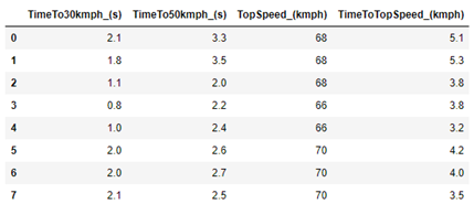
The “.drop” method requires two arguments: the first is a list with the name of the columns to be removed; the second is the axis that we want to remove (as we want the column to be removed, we use axis = 1). The new Data Frame (“df_scaled”, which will be changed shortly) has only the numerical data.
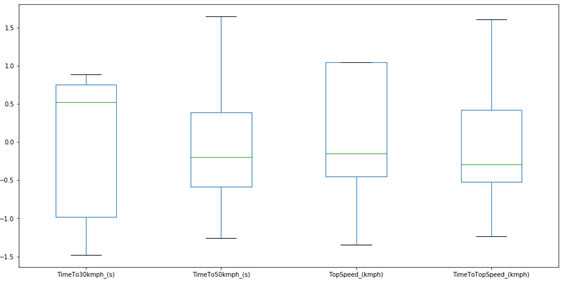
Something extremely important for PCA analysis is to verify the size of the data. For this, it is interesting to check the Boxplot of the original data.
plt.figure(figsize=(16,8))
df_scaled.boxplot()
plt.grid(False)
plt.show()
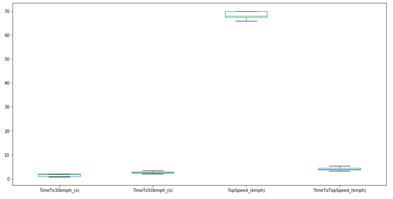
As we can see, with the exception of the maximum speed, the other variables have very close values. PCA analysis will always give higher importance to data with higher numerical value. So, if we use the data in its original form, the results will certainly be skewed to the maximum speed, since it has a numerical value much higher than the others. To check some basic statistics for the data, we can use the following method:
df_scaled.describe()
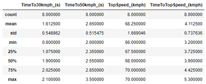
As we can see, the average of the TopSpeed variable is actually much higher than the others, which confirms a problem for the PCA.
In addition, we have the problem that the units between the variables are not the same. We have time data (in seconds) that are related to the acceleration of each kart, and we have speed data (in km/h). This is also a serious problem for PCA analysis, as the PCA looks only at numbers, without considering units.
For these reasons (and others not mentioned), it is common (and often advisable) to scale the data so that it starts to have an average equal to zero and a standard deviation equal to 1. Thus, all columns are in the same dimension, and the contribution for the main components it is similar. In this way, the data becomes dimensionless, and we no longer have problems with the different units. However, this is not always the right thing to do, it will depend on each case. For example, when we only have spectroscopic data, auto-scaling is probably not a good idea. In this case, it is essential.
To transform the data for each variable with mean equal to zero and standard deviation equal to 1, we use Equation 1.
\[xij = \frac{\bar{x}_j - x{ij}}{s_j}\]
In Python, it is common to use the StandardScaler () method, which can be imported from the “sklearn.preprocessing” library. However, this method uses the standard deviation for population data, not for sample data. When we have a lot of data, we would have no problem estimating the standard deviation as population. But in this case, and in the vast majority of cases with experimental data, we cannot consider the data as population-based. For this reason, StandardScaler () is not useful in this case.
But this is not a problem, as we can do iteratively in Python itself in a very simple way. First, we need the number of variables and individuals:
n_individuals = df_scaled.shape[0]
n_variables = df_scaled.shape[1]
And we also need the column names:
column_names = df_scaled.columns.values.tolist()
And now we need to calculate the mean and standard deviation for each column, and then iterate within each column, using Equation 1. And then, just do this for the other columns using a new for loop, within the first for loop. So, we need 2 for loops, which can be done as follows:
for j in range(n_variables):
    mean = df_scaled[column_names[j]].mean()
    std = df_scaled[column_names[j]].std(ddof=1)
    for i in range(n_individuals):
        df_scaled.loc[i,column_names[j]] = (df_scaled.loc[i,column_names[j]] - mean)/std
To make sure that the code above works, just use the Data Frames method “.describe ()” again.
df_scaled.describe()d
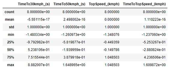
As we can see, the average of each column is now equal to zero, and the standard deviation is equal to 1. So, the code is correct. We can generate a new Boxplot to check how the data looks:
plt.figure(figsize=(16,8))
df_scaled.boxplot()
plt.grid(False)
plt.show()
Now we can run the PCA, but first, we need to import the PCA from the sklearn library:
from sklearn.decomposition import PCA
Next, we create a PCA instance. It is at this point that we decide how many PCs will be calculated, and how the regression will be made. The number of PCs is determined by the parameter n_components. If this parameter is not passed, the number of PCs will be determined automatically as the lowest value between the number of variables or the number of individuals. In this case, we have 4 columns and 8 rows; and then, the maximum number of PCs is 4.
At this point, we can also change the way the regression is done, but in general we have no reason to change. Unfortunately, sklearn does not have the option of using the NIPALS algorithm for regression, which is more suitable for experimental data, and uses the SVD method (the statsmodel library has both options implemented). Not that the SVD is bad, quite the contrary. It is also very efficient. As this is an exploratory analysis only, I will not change any parameters for the regression
pca = PCA()
pca.fit(df_scaled)
Now let’s look at the results. The first thing to do is check how much variance each PC can explain, which is done with the “pca.explained_variance_” method. We can check the amount of variance that each PC explains as follows:
for i in range(len(pca.explained_variance_)):
    print("Variance explained by PC" + str(i + 1) + " = " + "{:.3f}".format(pca.explained_variance_[i]))
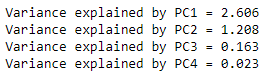
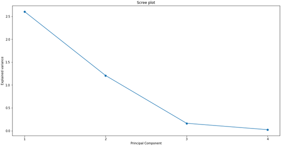
The first PC explains most of the entire data variance, the second explains a reasonable amount of the variance, and the other 2 explain the rest. We can generate a graph to better visualize the results, which is usually called “Scree plot”:
# explainde variance plot
plt.figure(figsize=(16,8))
plt.plot(np.arange(1,len(pca.explained_variance_) + 1), pca.explained_variance_, marker='o')
plt.xticks(np.arange(1,len(pca.explained_variance_) + 1))
plt.xlabel("Principal Component")
plt.ylabel("Explained variance")
plt.title("Scree plot")
plt.show()
However, it is easier to compare the variance in percentage form. Therefore, we calculate the percentage of variance that each PC explains, using “pca.explained_variance_ratio_”.
# explainde variance plot
# explained variance ratio
for i in range(len(pca.explained_variance_)):
    print("Variance explained (%) by PC" + str(i + 1) + " = " + "{:.2f}".format(pca.explained_variance_ratio_[i]*100))
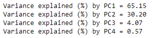
PC1 explains 65% of all data variance; PC2 explains another 30%. So, with just 2 PCs, we were able to explain more than 95% of the entire data variance! This is very good, as it gives us good indications that we will be able to remove a lot of information when comparing only the first 2 PCs. It may be possible to reduce all 6 graphs in Figure 1 into just one graph.
PCs are a linear combination of all the variables used. The first PC will always be the PC that contributes the most to the total variance, and it will always be in the direction where most of the data variance occurs. The second PC will always be perpendicular to the first PC. The third PC will always be perpendicular to the plane formed by PC1 and PC2. The fourth PC will always be perpendicular to the 3D system formed by PC1, PC2 and PC3, which would be a fourth dimension. And we will always have this sequence, so that the next PC will always be perpendicular to the composition of all previous PCs.
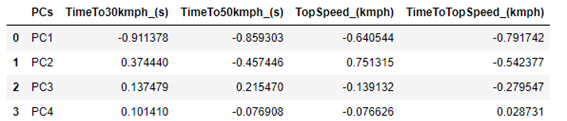
We can check which weights were calculated for each PC. In this case, PC1 will be a combination of a number (ranging between -1 and 1, which is generally called weight) that accompanies the variable TimeTo30kmph_ (s), another number (between -1 and 1, which is another weight) that accompanies the variable TimeTo50kmph_ (s), another number (between -1 and 1, which is another weight) that accompanies the variable TopSpeed_ (kmph) and another number (between -1 and 1, which is another weight) that accompanies the TimeToTopSpeed_ (kmph) variable.
The weight values can be accessed at “pca.components_”. But to facilitate visualization, we can place the weights in a Data Frame. But before that, I will create a list with the name of each PC, just to facilitate the presentation of data in the Data Frame:
pcs = []
for i in range(1, len(pca.components_)+1):
    pcs.append("PC" + str(i))
To create the dataFrame, we can do it this way:
df_weights = pd.DataFrame(pca.components_, columns=column_names)
df_weights.insert(0,"Principal Component", pcs, True)
df_weights
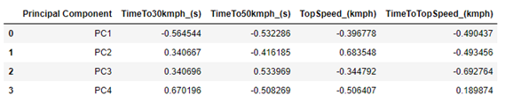
So, we have that PC1 is composed of a negative sum of all parameters, the most important (absolute values) being the variable TimeTo30Kmph_ (s), followed by TimeTo50kmph_ (s).
PC2 is composed of positive values of TimeTo30Kmph_ (s) and TopSpeed_ (kmph), and negative values of the other two variables. TopSpeed_ (kmph) is the variable that most contributes to explain PC2.
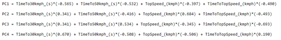
As the other two variables do little to explain the data, it does not seem worth paying much attention to them at the moment. We can make it a little clear how each PC is composed, presenting its equation. Among several ways, it can be done as follows:
# print the equations

for j in range(df_weights.shape[0]):

    equation = []
    for i in range(df_weights.shape[1]):
        if i == 0:
            equation = df_weights.loc[j][i] + " = "
        elif i < df_weights.shape[1] - 1:
            equation = equation + column_names[i-1] + "*(" + "{:.3f}".format(df_weights.loc[j][i]) + ") + "
        else:
            equation = equation + column_names[i-1] + "*(" + "{:.3f}".format(df_weights.loc[j][i]) + ")"
    print(equation)
    print("")
Once we have obtained the equations, we can calculate the value of each individual for each PC, and generate a graph to compare the pairs of PCs. This calculated value is generally called a score, and is a simple multiplication. For example, for Wario’s PC1 score we have the following:
\[SCORE_{WARIO_{PC1}} = 0.706 \times(-0.565) + 0.097 \times(-0.532)\]
\[+ 1.048 \times(-0.397) + (-0.152) \times(-0.490)\]
\[SCORE_{WARIO_{PC1}} = -0.791\]
It is important to emphasize that we have to use the autoscaled values, and not the actual values, since the model was generated using the autoscaled values. We could calculate the scores for each individual on each PC dynamically, which could be done through a for loop. But we have the “pca.transform ()” method already implemented, which does this for us. To generate the scores and present them in a Data Frame, just make:
# The scores
scores = pca.transform(df_scaled)
df_scores = pd.DataFrame(scores, columns=pcs)
df_scores.insert(0,"Individuals",df['Personagem'],True)
df_scores
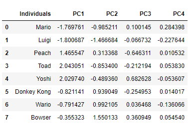
Note that the score returned to Wario on PC1 is exactly the same as that obtained by calculating manually.
We can now use each pair of PCs to generate a graph and view the results. Since PC1 and PC2 explain more than 95% of the data variance, we will probably be able to get most of the interpretations out of this graph. We can do as follows:
# The score plot
PC_x = 0 # 0 for the PC1
PC_y = 1 # 1 for the PC2

plt.figure(figsize=(8,8))
sns.scatterplot(scores[:,PC_x], scores[:,PC_y], hue=df['WeightClass'], s=100)
for i in range(scores.shape[0]):
    plt.text(scores[:,PC_x][i]*1.05, scores[:,PC_y][i]*1.05, df['Personagem'][i])

plt.xlabel("PC" + str(PC_x + 1) + " ({:.2f}".format(pca.explained_variance_ratio_[PC_x]*100) + "%)")
plt.ylabel("PC" + str(PC_y + 1) + " ({:.2f}".format(pca.explained_variance_ratio_[PC_y]*100) + "%)")
plt.title("Score plot: PC" + str(PC_x + 1) + " versus PC" + str(PC_y + 1))
plt.axhline(y=0, linestyle='--', c='k')
plt.axvline(x=0, linestyle='--', c='k')
plt.show()
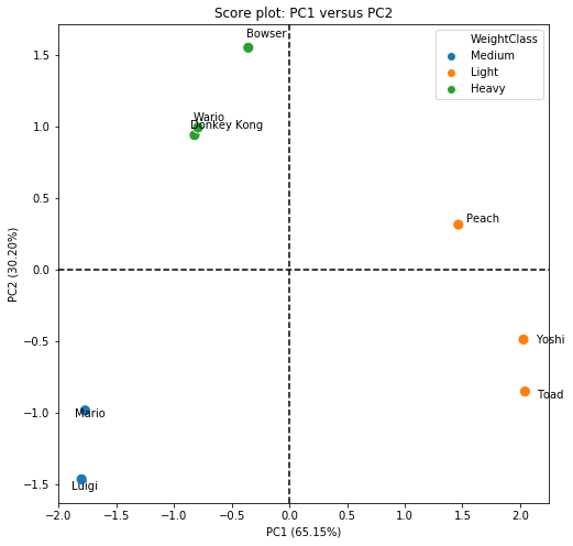
Through the comparison obtained in the score plot, we were able to clearly separate the data into 3 very distinct groups. PC1 is able to separate the group of light karts from the others. This is easily observed, since Yoshi, Toad and Peach are on the positive side of the x-axis, while the others are on the negative side (PC1). However, we clearly see that Peach is different from Yoshi and Toad, and this difference is characterized by PC2. To try to find out why, let’s look at the equation of PC1, which is the PC that separates light karts from others:
\[ PC1 = TimeTo30kmph \times (-0.565) + TimeTo50kmph \times (-0.532)\] \[+ TopSpeed \times (-0.397) + TimeToTopSpeed \times (-0.490)\]
PC1 is composed mainly of contributions (all negative) from TimeTo30Kmph, TimeTo50kmph and TimeToToSpeed. So, what most differentiates Peach, Toad and Yoshi from the others, is the acceleration of the karts.
PC2 is able to separate the group of heavy and medium karts. We have that positive values of PC2 are related to heavy karts, while negative values are related to light karts. But to interpret it better, let’s look at PC2:
\[ PC2 = TimeTo30kmph \times (0.340) + TimeTo50kmph \times (-0.416)\] \[+ TopSpeed \times (0.683) + TimeToTopSpeed \times (-0.493) \]
PC2 is mostly composed of the TopSpeed variable (with positive contribution), and a little bit also by the time to reach the maximum speed (with negative contribution).
Based on the score chart, it is possible to say that we actually have 4 kart classes, not 3: the light ones (Yoshi and Toad), the medium ones (Mario and Luigi), the heavy ones (Bowser, DK and Wario) and the Princess (Peach). Although she has more characteristics of a light kart, she is not exactly the same as Toad and Yoshi. This is most likely linked to the maximum speed, as Peach has a higher maximum speed than other light karts.
The score chart is the most important in PCA analysis, as it has the potential to drastically reduce the amount of original information. However, this way of looking at the scores graph and the equations is not very usual, as we can also represent the equations graphically, thus generating the weight graphs. And it is also possible to combine the score and weight graphs in a single graph, the so-called Biplot.
PCA is a technique based on analytical geometry, and the data compression power comes from the graphical visualization that we can obtain. We can compare the PCs with each other, as if they were original variables. PCs are, in fact, variables composed of the original variables, being possible to use them for data prediction (we will not see this here). Thus, the signs of the weights that compose the PCs are very important, and it is important to look at both the scores and the sign of the weights. To generate the weights graph between PC1 and PC2, just do as follows:
# The weight plot
weight = pca.components_
PC_x = 0
PC_y = 1

plt.figure(figsize=(8,8))
plt.scatter(weight[PC_x], weight[PC_y])

for i in range(len(column_names)):
    plt.text(weight[PC_x][i], weight[PC_y][i], column_names[i])
plt.xlabel("PC" + str(PC_x + 1) + " ({:.2f}".format(pca.explained_variance_ratio_[PC_x]*100) + "%)")
plt.ylabel("PC" + str(PC_y + 1) + " ({:.2f}".format(pca.explained_variance_ratio_[PC_y]*100) + "%)")
plt.title("Weight plot: PC" + str(PC_x + 1) + " versus PC" + str(PC_y + 1))
plt.axhline(y=0, linestyle='--', c='k')
plt.axvline(x=0, linestyle='--', c='k')
plt.show()
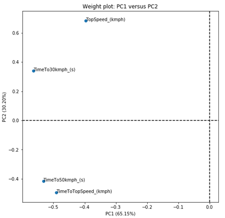
But that graph was not very interesting. As all values of PC1 are negative, we do not have the 4 quadrants on the graph. But let’s try to solve this problem by calculating the weight projections instead of the weights themselves. We do this by calculating the standard deviation of each PC, and multiplying the standard deviation of each PC by the weights of each variable that makes up the PC.
\[ Projections_{ij} = \sqrt{s_j^2} \times weigths_{ij} \]
An way to do this in Python is as follows:
# The weight projections
sqrt_variances = np.sqrt(pca.explained_variance_)

covar = []
for i in range(len(pca.components_)):
    covar.append(pca.components_[i]*sqrt_variances[i])
df_covar = pd.DataFrame(covar, columns=column_names)
df_covar.insert(0,"PCs", pcs, True)
df_covar
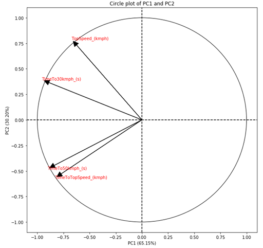
The projections also vary between -1 and +1, but they also consider the amount of variance that each PC explains. In this way, the projections are more interesting to observe. But the projections are linked to the direction in which the PCs are, and not at a fixed point as we obtained in the weight chart. Therefore, it is common to present projections as arrows instead of points. Furthermore, as projections also consider the amount of variance that the PCs explain, the absolute value of the projections indicates how important the variable is to explain the variance of the two PCs being compared. Therefore, it is also common to add a circle with radius equal to 1 in the center of the graph. Thus, the arrows that are close to the circle, indicate that that variable is strongly related to the variance explained by the PCs being compared.
Adding a circle to a chart in Python is not that simple. We need to create an instance of a circle and then add it to the chart. But before that, we need to create an axis to be able to add the circle. And before that, we need to create a subplot.
# The Circle plot
PC_x = 0
PC_y = 1
fig = plt.figure(figsize=(8,8))
ax = fig.add_subplot(1,1,1)
circ = plt.Circle((0,0), radius=1, fill=False)
ax.add_patch(circ)
plt.scatter(covar[PC_x],covar[PC_y])
We still need to add the arrows, which we have to do one by one. But doing this is quite simple, as we can just add the arrows in the same for loop where we add the name of each projection of the variables:
for i in range(len(column_names)):

    plt.arrow(0,0,covar[PC_x][i]*.975,covar[PC_y][i]*.975, head_width=0.05,head_length=0.05, fc='k', ec='k')
    plt.text(covar[PC_x][i]*1.05, covar[PC_y][i]*1.05, column_names[i], c='r')
plt.xlabel("PC" + str(PC_x + 1) + " ({:.2f}".format(pca.explained_variance_ratio_[PC_x]*100) + "%)")
plt.ylabel("PC" + str(PC_y + 1) + " ({:.2f}".format(pca.explained_variance_ratio_[PC_y]*100) + "%)")
plt.title("Circle plot: PC" + str(PC_x + 1) + " versus PC" + str(PC_y + 1))
plt.axhline(y=0, linestyle='--', c='k')
plt.axvline(x=0, linestyle='--', c='k')
plt.show()
Now that we have the graphs of scores and weights, we can build the Biplot. Biplot combines these two graphs into a single one, in order to compress the information of individuals and weights into a single graph.
In many cases, this graph becomes very polluted and makes it difficult to observe the results, so I particularly prefer to place the graphs of scores and weights side by side instead of using the Biplot. But still, the Biplot is a very useful chart.
To generate the Biplot, we initially plot the score graph and then placed the projection arrows on top of the score graph. The drawback of this method is that the projections are always between -1 and 1, and it is quite possible that the arrows would be small. Therefore, an adjustment in the length of the arrows is important, which is done using a simple rule of three for the PC of the x axis and for the PC of the y axis. For this reason, it is not appropriate to add the circle to the Biplot, as the limit of the arrows will no longer be 1. Therefore, it is very important to emphasize that in the Biplot the arrows must be observed only in terms of their direction, the size of which does not correspond to the value originally calculated.
# The Biplot

PC_x = 0
PC_y = 1

# the score plot
plt.figure(figsize=(8,8))
sns.scatterplot(scores[:,PC_x], scores[:,PC_y], hue=df['WeightClass'], s = 100)

for i in range(n_individuals):
    plt.text(scores[:,PC_x][i]*1.05, scores[:,PC_y][i]*1.05, df['Personagem'][i])

# adapt the projections
x_max = np.abs(scores[:,PC_x]).max()
y_max = np.abs(scores[:,PC_y]).max()

covar_x_max = np.abs(covar[PC_x]).max()
covar_y_max = np.abs(covar[PC_y]).max()

arrow_rescaled_x = []
arrow_rescaled_y = []
for i in range(len(column_names)):
    arrow_rescaled_x.append(x_max*covar[PC_x][i]/covar_x_max)
    arrow_rescaled_y.append(y_max*covar[PC_y][i]/covar_y_max)

# the projections
for i in range(len(column_names)):

    plt.arrow(0,0,arrow_rescaled_x[i]*.975,arrow_rescaled_y[i]*.975, head_width=0.05,head_length=0.05, fc='k', ec='k')
    plt.text(arrow_rescaled_x[i]*1.05, arrow_rescaled_y[i]*1.05, column_names[i], c='r')

plt.xlabel("PC" + str(PC_x + 1) + " ({:.2f}".format(pca.explained_variance_ratio_[PC_x]*100) + "%)")
plt.ylabel("PC" + str(PC_y + 1) + " ({:.2f}".format(pca.explained_variance_ratio_[PC_y]*100) + "%)")
plt.title("Biplot: PC" + str(PC_x + 1) + " versus PC" + str(PC_y + 1))
plt.axhline(y=0, linestyle='--', c='k')
plt.axvline(x=0, linestyle='--', c='k')

x_minimum = min(min(arrow_rescaled_x), scores[:,PC_x].min())
x_maximum = max(max(arrow_rescaled_x), scores[:,PC_x].max())
plt.xlim(x_minimum*1.2, x_maximum*1.2)

y_minimum = min(min(arrow_rescaled_y), scores[:,PC_y].min())
y_maximum = max(max(arrow_rescaled_y), scores[:,PC_y].max())
plt.ylim(y_minimum*1.2, y_maximum*1.2)

plt.savefig("biplot.png", dpi=100, bbox_inches='tight')

plt.show()
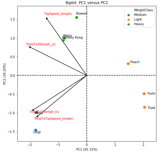
As a general discussion, we can say that we have 4 classes of karts. The first is the light karts class, which is composed of Yoshi and Toad and is characterized by high acceleration. The second is the middle class, which is composed of Mario and Luigi, and is characterized by low acceleration and low speed. The third is the heavy class, which is made up of Bowser, Wario and DK, and is characterized by a high final speed. And finally, we have the Princess Peach class, which is a kart with high acceleration, but which also has a high final speed, being an intermediary of the light and heavy classes.
It is important to note that these results are based only on the 4 characteristics evaluated. We do not have, for example, a variable that represents the handling of the kart, which is the main advantage of the middle class (Mario and Luigi). This means that, the PCA analysis will separate the data in relation to the measures that were obtained for the individuals, and therefore, it does not make miracles. But this is just an example of how to apply PCA in Python, and not a cute theoretical example where everything would work out.
Conclusion
With this, I finish this article about Mario Kart 64 PCA. But this is not all that can be done with PCA; it is also possible to estimate the contribution of each variable and each individual to the PCs, as well as the cos2, both for the variables and for the individuals. It is also possible to use PCs as new variables, and adjust models to the calculated scores. The PCA universe is very powerful, especially for exploratory data analysis. but it should always be done carefully, due to the data transformations that are usually necessary.
The code
You can download the whole code that I used in the post here.
The data
You can download the Mario Kart 64 data (csv) here.